Methodology · renewable fleet map
We mapped four European wind fleets turbine by turbine — and Germany’s solar fleet cell by cell
Four national wind registers. One German solar register. A weather field at 100 metres. This is how we turn them into a map that can move through the day without pretending that modelled output is a meter reading.
Published 2026-08-08 · snapshots dated 5–7 August 2026 · open the live fleet map
The short version
The wind layer covers operating assets in Germany, Great Britain, Norway and the Netherlands. The solar layer covers Germany only. Wind geometry comes from national registers, with Great Britain using the government’s Renewable Energy Planning Database for project capacity and OpenStreetMap for turbine positions. German solar comes from the Bundesnetzagentur’s Marktstammdatenregister and is aggregated into 0.1° cells because millions of rooftop installations are a field, not a useful cloud of pins.
Weather comes from Open-Meteo. Wind is sampled at 100 metres; solar uses shortwave radiation. A simple, disclosed physical conversion runs in the browser for every selected hour. That last sentence matters: the map displays modelled output, not metered generation. It is a spatial explanation of what the registered fleet could be doing under the selected weather field.
4
wind countries
68.9 GW
German geolocated solar subset
100 m
wind height
0.1°
solar cell size
What the map encodes
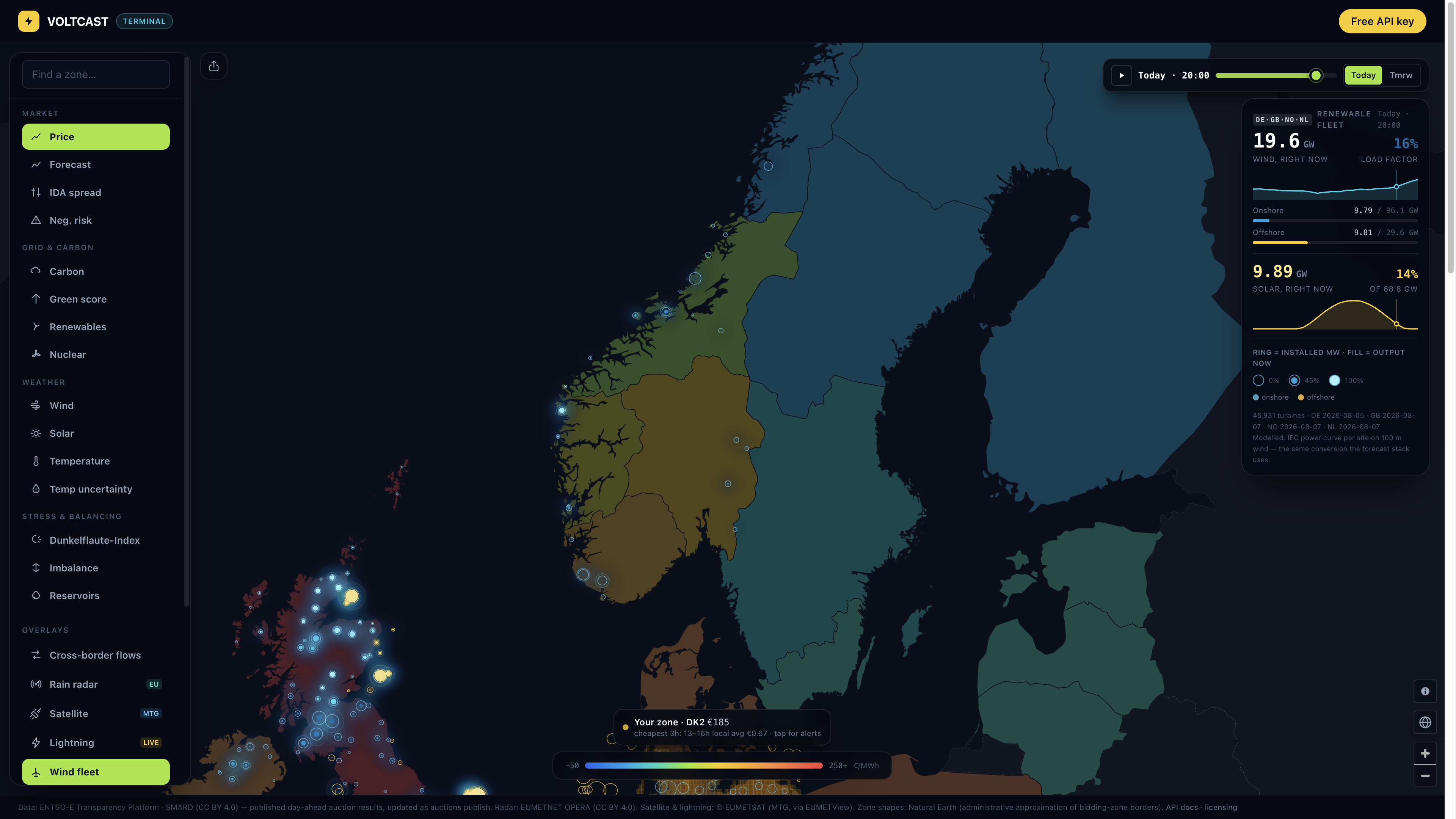
Each wind mark carries two quantities. The outer ring scales with the square root of installed megawatts. The filled core scales with the square root of installed megawatts multiplied by the modelled capacity factor. Square-root scaling lets a 5 MW farm and a 1,000 MW offshore array remain legible on the same screen. The unfilled gap is headroom: registered capacity that the selected weather does not activate.
Colour separates siting, not performance. Cyan marks onshore wind. Gold marks offshore wind. At wider zooms the browser aggregates assets into regional bubbles. Zoom in and those become farms; zoom farther and the turbine endpoint streams individual machines inside the visible bounding box. The transition thresholds are deliberate: regions below zoom 6.4, farms above 6.4, individual turbines above 9.6.
The soft “aurora” beneath the rings is a heat map weighted by modelled megawatts. It answers a different question from the ring: not “where is capacity installed?” but “where does this weather field activate the most registered capacity at this hour?” A pulse is reserved for the largest producing farms, capped at 140 marks and disabled for reduced-motion users. It is an attention cue, never another variable.
The wind physics, without a black box
Wind speed is not power. Below cut-in, a rotor does not generate. Between cut-in and rated speed, power rises sharply. Above rated speed, output is capped until storm cut-out. We use one generic IEC-class curve: 3 m/s cut-in, 12 m/s rated, 25 m/s cut-out. Between 3 and 12 m/s the capacity factor follows a cubic ramp; between 12 and 25 m/s it is one; outside that range it is zero.
A generic curve is less precise than a manufacturer-specific curve. It is also honest when many registers do not provide a reliable turbine model. The map preserves manufacturer and model where a register has them, but the displayed output does not imply that we possess the proprietary power curve for every machine. The limitation is visible because a plausible map is not the same thing as a calibrated plant forecast.
The aggregation order is the most important technical choice. We apply the curve at each site and then add output. We do not average the wind across a country and apply one curve to that average. In the sub-rated region power is approximately cubic, so mean power at local wind speeds is not the power at mean wind speed. Once local variation is discarded, no later model can recover it.
capacity factor = 0                                when v < 3 or v ≥ 25 m/s
capacity factor = ((v³ − 3³) / (12³ − 3³))         when 3 ≤ v < 12 m/s
capacity factor = 1                                when 12 ≤ v < 25 m/s
modelled MW     = registered capacity × capacity factor
Why the weather travels as a field, not as output
The public field endpoint ships weather values and interpolation weights. It does not ship a new megawatt value for every farm every time the hour changes. The browser interpolates each asset from its three nearest field points and applies the curve locally. That makes the hour scrubber immediate and keeps the API payload small enough for a public map.
The field spans roughly yesterday through three forecast days. It is a point-sampled field, not native model GRIB. Germany uses 40 capacity-weighted points; smaller fleets use fewer. This is a large improvement over a country centroid, but it cannot represent every coastal gradient, wake interaction, local terrain effect or offshore stability regime. The source values are provider-interpolated to our points.
Germany: the register that makes a turbine map possible
Germany’s Marktstammdatenregister is unusual in both breadth and granularity. The 5 August 2026 snapshot parsed 43,356 wind units across operating, planned and decommissioned states. We display only status 35, “in operation”: 30,346 onshore units with 70.26 GW and 1,768 offshore units with 10.90 GW. Coordinates exist for 96.8% of that operating fleet; hub height for 97.8%; rotor diameter for 99.0%.
The independent cross-check caught a real ingestion error. In the first parse, all 10.90 GW of offshore wind appeared onshore because the bulk XML uses numeric catalogue codes, not the German text shown in the web interface. The correct discriminator is 888 for onshore and 889 for offshore. A national-capacity reconciliation exposed the mistake before it reached the map. The corrected rule now has a regression test.
Great Britain: showing 88% is better than inventing 100%
Great Britain does not publish one complete per-turbine government register. The Renewable Energy Planning Database provides project capacities and turbine counts, but positions are project-level. We pair those projects with OpenStreetMap turbine geometry. A consent is admitted only when the mapped cluster supplies at least 75% of the turbine count declared by the register and the cluster is spatially coherent.
The resulting layer contains 9,218 turbine positions and 27,819 MW, equal to 88.3% of REPD operational capacity in the frozen build. Missing capacity stays missing. We do not scatter synthetic turbines around a project centroid to make the total look complete. Project capacity is allocated across the located turbines and the map identifies the hybrid provenance: DESNZ REPD for the registered project and OpenStreetMap contributors for the positions.
Norway and the Netherlands: different registers, different caveats
Norway’s NVE turbine layer supplies positions but not turbine-level capacity, hub height or rotor diameter. We allocate plant capacity across the turbines declared for that plant. The frozen live layer covers 1,366 onshore turbines and about 4.9 GW. It does not include offshore Hywind as if it belonged to the onshore register. The absence is disclosed rather than silently merged from an incompatible source.
The Netherlands uses RIVM’s Atlas Leefomgeving wind-turbine service. Its capacity, hub and rotor fields are complete in the admitted snapshot, and its national capacity reconciles to roughly 99% of ENTSO-E installed wind capacity. That agreement is a validation check, not proof that every row is perfect: ENTSO-E and a turbine register measure related but not identical populations and can differ at their update boundaries.
Solar is a surface, not a million pins
Germany’s solar register spans millions of units and tens of gigabytes of XML. Plotting every balcony module and rooftop array would make the browser slower while suggesting false point precision. We retain operating units with usable coordinates and aggregate them to 0.1° cells. Each cell stores installed capacity, unit count, capacity-weighted tilt, and a rooftop/ground split.
The frozen load contains 4,880 cells and 68.9 GW. Germany’s national installed solar fleet is closer to 100 GW. The difference is not “missing generation”; it is the documented effect of restricting the map to operating units with coordinates. The 68.9 GW figure is therefore a geolocated operating subset, suitable for spatial sampling and unsuitable as a national capacity headline.
Solar capacity factor is the selected hour’s shortwave radiation divided by 1,000 W/m² and capped at one. This is a clear irradiance proxy, not a full PV model. It does not resolve module temperature, inverter clipping, snow cover, azimuth diversity, shading, curtailment or behind-the-meter consumption. The map’s job is to show where registered capacity meets the broad weather field—not to settle an individual roof.
What changes when you scrub the hour
Geometry does not move. Registered capacity does not change. Only the weather-driven core and heat field change. At night the solar mosaic drains to zero. In a windy North Sea hour the large offshore rings fill and the aurora concentrates offshore. During a continental lull the same rings remain visible as empty capacity. That constancy is why the ring/core grammar works: capacity is the denominator and weather is the changing numerator.
The Terminal keeps the exact selected state in the URL. ?fleet=1 turns on wind;
?pv=1 turns on German solar. A shared link preserves those layers and the selected hour.
The same renderer can export a PNG or record a 24-hour loop with attribution composited into the frame.
The media in this article was captured from that product path, not redrawn for publication.
Failure modes are part of the product
If fresh weather cannot be loaded, capacity remains useful. Rings stay on the map with neutral fill, the modelled-GW field becomes an em dash, and the footer says that output is unavailable. A stale or failed model must not turn into a confident zero. Geometry artifacts are written atomically and the provenance stamp is written last, so clients do not read a new manifest beside half-written tiers.
Register freshness is assessed per source. Germany’s underlying MaStR snapshot is not currently refreshed automatically by the daily map bake; an operator task tracks that decision. Sweden was rejected because its erected records were frozen in 2022. Denmark’s open bulk export was likewise too old. France’s national register has commune-level rather than turbine-level coordinates. A large-looking map assembled from stale or invented geometry would be less useful than a smaller one with a disclosed boundary.
Known limitations
- Output is modelled from weather and generic physics; it is not SCADA or metered generation.
- Great Britain covers 88.3% of frozen REPD operational capacity, not the full national fleet.
- Germany’s solar layer is a geolocated operating subset and Germany is the only solar country shown.
- Wind uses a generic IEC curve rather than manufacturer-specific power curves.
- Open-Meteo values are interpolated point samples, not native high-resolution NWP fields.
- Norwegian capacity is allocated from plant to turbine; hub and rotor metadata are mostly absent.
- Coordinates, commissioning dates and register statuses inherit each source’s reporting lag.
- The display does not model wakes, curtailment, outages, icing, terrain or grid constraints.
Sources and licences
| Layer | Source | Licence |
|---|---|---|
| DE wind + solar | Bundesnetzagentur MaStR | DL-DE-BY-2.0 |
| NL wind | RIVM Atlas Leefomgeving | CC BY 4.0 |
| NO wind | NVE | NLOD |
| GB capacity | DESNZ REPD | OGL v3.0 |
| GB positions | OpenStreetMap contributors | ODbL |
| Weather field | Open-Meteo | CC BY 4.0 |
Weather data by Open-Meteo.com. Register attribution and redistribution terms are maintained on our data-licensing page.
Reproduce the reading
- Open the Terminal with wind enabled.
- Use the hour scrubber. Watch ring geometry stay fixed while the cores change.
- Enable German solar and compare night with noon.
- Zoom through the region, farm and turbine levels; inspect source and capacity in the tooltip.
- Open the HUD and confirm that totals are labelled modelled, with source attribution beside the map.
Citation
Voltcast Research (2026), “We mapped four European wind fleets turbine by turbine — and Germany’s solar fleet cell by cell,” published 8 August 2026. Fleet snapshots 5–7 August 2026. Cite source registers separately where their licence requires it.
The point is not the animation
The animation makes a complex system legible, but the durable result is the contract beneath it: register identity, status filter, snapshot date, spatial confidence, weather source, physical conversion, degradation behavior and licence travel together. A map becomes research-grade when a reader can tell which marks are observations, which are registered facts, which are model output, and where the map stops.
Open the wind and solar fleet in the Voltcast Terminal. It is free, requires no account, and keeps the caveats on the same screen as the picture.
The monthly European power roundup
Negative-price records, the biggest spreads, which zones were hardest to forecast — every number computed from our production data, on the 2nd of each month. No filler, unsubscribe anytime.